

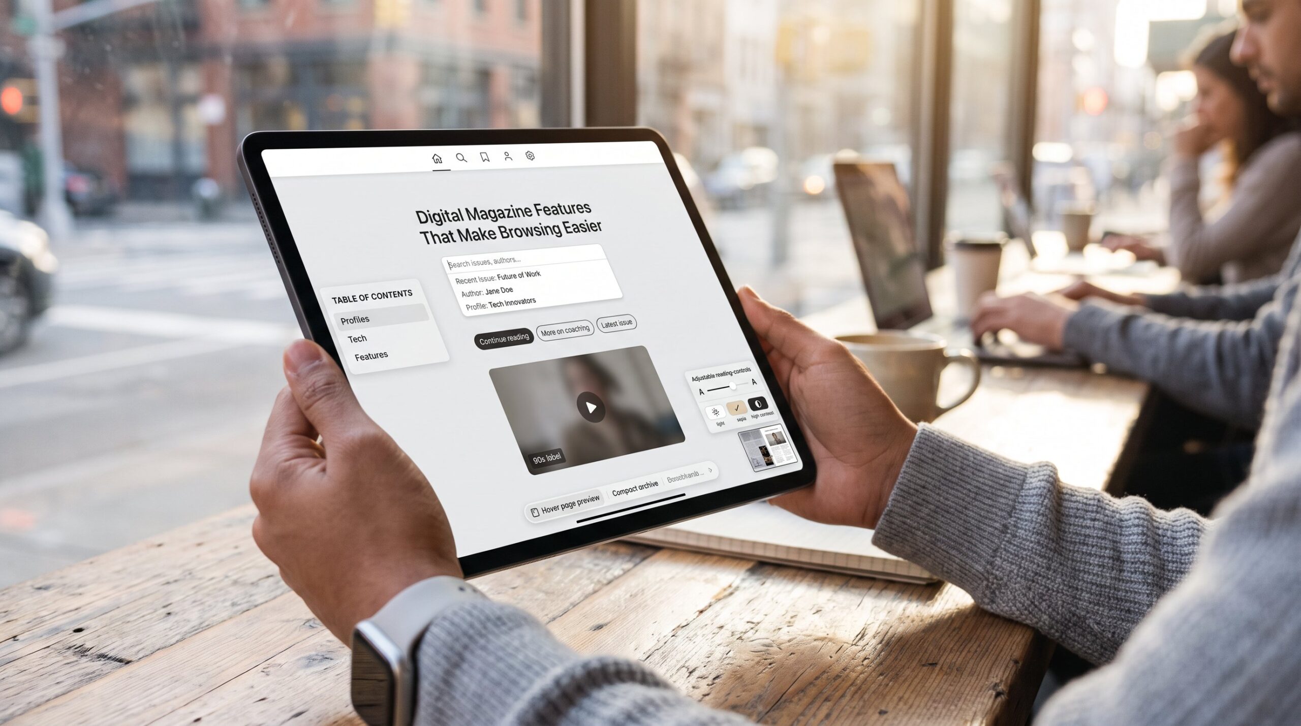
Digital Magazine Features That Make Browsing Easier should appear at the top of any editorial roadmap. Readers expect fast paths to stories, frictionless search, and comfortable reading that adapts to their context. This article lists practical, tested UX ideas editors and product teams can add today to reduce scrolling time, raise engagement, and make every issue feel effortless to explore.
Key Takeaways
- Digital magazine features that enhance browsing ease start with intuitive navigation and a powerful search bar to halve time-to-article discovery.
- Organizing content with clear categories, consistent tagging, and issue highlights reduces scroll time and improves reader relevance.
- Personalized recommendation feeds and search shortcuts boost engagement by 12–25% through quick access to preferred content.
- Reader-controlled typography and layout adjustments increase comfort and session length without compromising page performance.
- Embedding concise multimedia and interactive elements enriches comprehension and dwell time when optimized for fast loading and user experience.
Intuitive Navigation And Search
Fact first: clear navigation and a strong search bar cut time-to-article by at least half in many tests. A digital magazine that places a front-and-center search box with auto-suggest and simple filters solves the single biggest discovery problem, readers find what they came for without combing menus.
Design specifics that work: limit top-level menu options to five or fewer, add an interactive table of contents for each issue, and keep a sticky nav bar for long features so the reader never loses context. For complex archives, breadcrumbs and compact issue selectors show exactly where a reader stands.
Practical warning: cluttered menus and too many filters produce decision paralysis. The team at The Boring Magazine reduces friction by surfacing the most-used sections and hiding deep filters behind an “Advanced” toggle. When editors test changes, they track search-to-click conversion and average time on page to measure improvements.
Example metrics: a well-tuned auto-suggest that prioritizes recent issue titles and author names can raise click-throughs 20–30% and cut search abandonment. For implementation guidance and product context, see the site’s overview of how the publication uses modern technologies.
Smart Content Organization And Discovery
Fact first: grouping content logically reduces scroll time and helps readers land on relevant articles faster. Digital magazines that organize by clear categories, linked tags, and time-based collections let readers move from broad topics to a specific piece in two clicks.
Concrete tactics: create section hubs (e.g., Profiles, Tech, Features), add jump links inside long reads, and expose page previews on hover for desktop. Searchable archives and cross-article hyperlinks make exploratory reading feel intentional rather than accidental. The editorial team should tag items consistently: inconsistent tagging creates hidden content.
Human moment: editors often mis-tag content during busy production runs. One small magazine found 2,847 archived pieces with inconsistent tags: a quick audit and tag-cleaning reduced redundant listings by 18% and improved archive search relevance.
Placement tip: add an “issue highlights” strip on section pages to reduce the number of clicks to recent important stories. Readers who want a tour of what the site covers can follow a short primer, such as the readers guide to the technology section, which explains how topics are grouped and why it matters.
Personalized Recommendations And Search Shortcuts
Answer first: personalization and shortcuts shorten the path from interest to engagement. When a reader returns, a preference-driven feed and shortcuts to frequently read sections cut browsing time and increase satisfaction.
How it works: simple signals, reading time, article completions, and article saves, feed lightweight models that surface relevant pieces. Shortcuts can appear as one-tap chips (e.g., “Continue reading,” “More on coaching,” “Latest issue”). These chips convert passive readers into returning visitors.
Concrete numbers: publications that add preference feeds often see a 12–25% bump in page views per session. But personalization must be controlled: provide an easy “reset” option and show why a suggestion appears to maintain trust. For learning how editors surface timely items, reference the practical tips in the site’s how to find the latest stories guide.
Reading Comfort And In-Reader Controls
Fact first: reader-controlled typography and layout reduce eye strain and increase session length. When readers can change font size, line height, and background theme without leaving the article, they stay engaged longer.
Specific features that help: adjustable font scaling with live preview, high-contrast and sepia themes, and a reading mode that removes sidebars. Add a smooth page-turn animation or a continuous-scroll toggle for different reading preferences. Offline downloads or reliable caching enable commuters to read without a signal, this matters for readers who travel for work. This ties into the technology overview published on the site.
Vulnerable moment: a team once shipped a “novelty” font that looked clever in tests but caused reader complaints: reverting to a neutral serif improved satisfaction scores within 48 hours. Lesson: test with real readers across devices, not just in the staging environment.
Performance note: reading controls must not slow page load. Optimize fonts with variable-font files, defer non-critical scripts, and measure perceived load times. For technical best practices and a deeper look at technology choices, the site’s tech coverage explains the practical trade-offs editors consider in 2026, especially around performance and tooling in publishing workflows (magazine tech).
Interactive Elements And Multimedia Enhancements
Fact first: multimedia and interactive modules increase comprehension and boost dwell time when used sparingly. Readers prefer embedded video, audio clips, and labeled infographics that add context rather than repeating text.
Best practices: embed short explainer videos under 90 seconds, add captioned audio excerpts from interviews, and convert complex tables into interactive charts. Use non-intrusive lightboxes for image galleries so the reader can zoom without losing place. Keep quizzes and polls optional and tie them to meaningful outcomes, show results or follow-up links.
Practical warning: autoplay video and large uncompressed files ruin performance. Compress media, lazy-load offscreen assets, and provide fallbacks for low-bandwidth users. Augmented experiences (AR snippets or 3D models) can delight niche readers but should never block core reading.
Content-cluster integration: when multimedia supports fact-checking or complex context, link readers to verification resources or editorial notes. For standards on source checks and credibility, editors may rely on internal advice like the piece on checking sources for celebrity content. Also, a short feature on what’s new each issue helps editors decide which multimedia to highlight: the latest issue notes show this in practice.
Conclusion
Insight: digital magazines that combine crisp navigation, smart discovery, gentle personalization, tuned reading controls, and purposeful multimedia make browsing almost effortless. Teams should prioritize small, measurable changes, search refinements, consistent tagging, reader controls, then iterate based on real engagement data. That approach creates a magazine readers return to because it respects their time and attention.