
You don’t need a mirrorless camera, strobes, or a studio rental to publish images that look professionally shot. What you do need is a repeatable, mobile-first workflow: one tool to generate on-brand looks from your own photo, one to polish tone and color, one to fix distractions, one to package assets for Reels covers and carousels—and a handful of “guardrails” so your edits stay realistic. Below is a pragmatic stack (in the order you’ll actually use it), starting with the generator that turns a single upload into multiple studio-style variations.
1) Ideal Creator — Upload Yourself, Prompt The Vibe (Ultimate Pick)
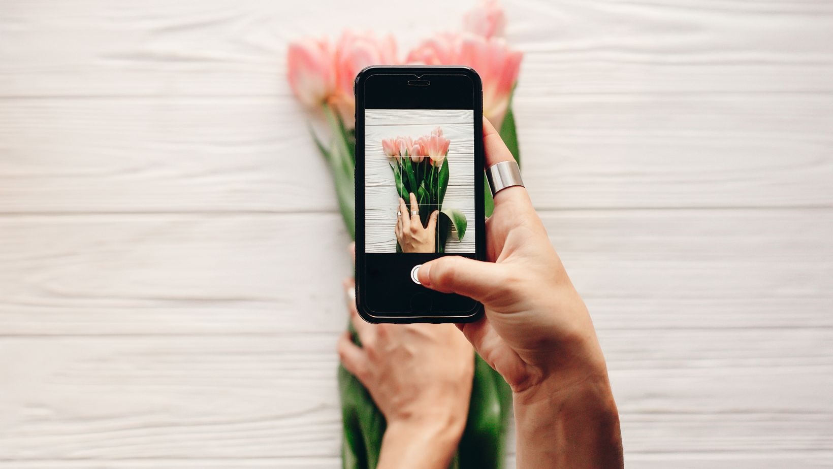
If your goal is “I shot this in a studio” from a normal phone pic, start here. You upload your photo and prompt the scene you want—editorial softbox on matte gray, creamy daylight through sheer curtains, minimal cyclorama with a gentle rim light—then refine background cleanliness, depth of field, and overall mood so it matches your grid. Because you remain the subject, results feel like retouching and set design rather than a face swap.
What makes it studio-grade
- Identity coherence: preserves skin texture and facial geometry while harmonizing light and background.
- Batchable sets: one upload quickly yields hero portraits, tight crops, banner-style horizontals, and alternative backgrounds for carousels.
- Grid consistency: lock color stories (beige/cream, film-warm, moody-cool) so the week’s posts look like one planned shoot.
Starter prompts to copy
- “Neutral matte backdrop, softbox key, faint rim light, shallow depth of field, skin-true tones.”
- “Golden-hour window light, warm highlights, minimalist apartment background, realistic bokeh.”
- “Studio gray cyclorama, crisp contrast, gentle vignette, no clutter.”
Export your best 4–8 variations at high resolution; you’ll resize later for Instagram.
2) Lightroom Mobile — Pro Tone, Color, And Consistency
Lightroom is where your set becomes cohesive. Use it to standardize exposure and color across all variations:
- Exposure: +0.2 to +0.5 for airy feeds; protect highlights (−15 to −30) to keep skin texture.
- Shadows: +10 to +25 so hair and jackets read.
- White balance: warm for cozy, cool for minimal; micro-adjust Tint (−3 to +3) to keep skin natural.
- HSL: gently desaturate overshifted oranges/yellows; deepen blues for denim/sky.
- Local masks: lift the face by +0.1 EV, dodge eyes slightly, and calm hot spots on forehead/cheek.
Preset strategy: build three “house looks” (Bright Neutral, Film Warm, Moody Cool) and apply them by week so your grid tells one visual story.
3) Snapseed — Local Fixes in Seconds
Snapseed’s Healing tool removes tiny distractions (wall scuffs, stray cables, dust on mirrors). Selective or Brush lets you nudge exposure on the face, darken a loud background patch, or smooth a harsh corner—fast, realistic, and all on phone.
4) TouchRetouch — Bigger Cleanup, Pro Results
When distractions are larger—photobombers, signboards, overhead wires—TouchRetouch is surgical. Clean images read as expensive because the viewer’s first read is the subject, not the mess behind them. Use this before adding text overlays or crops to avoid jagged edges.
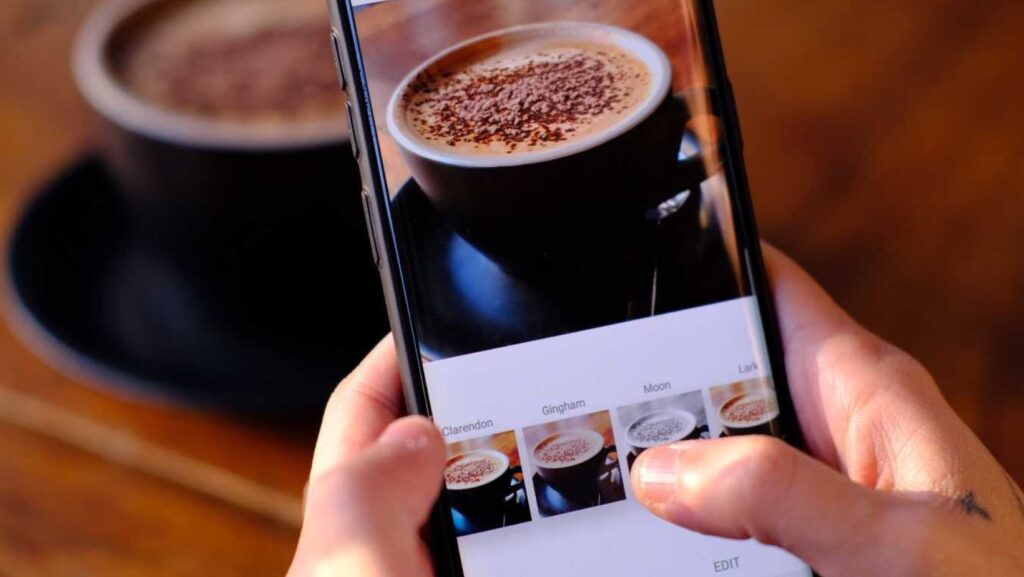
5) VSCO — Tasteful Mood (Don’t Overdo It)
If your brand relies on “film feel,” VSCO’s presets offer grain and halation-like glow that won’t wreck skin tones when used lightly. Keep intensity low and grain modest; the goal is vibe, not vintage cosplay. Save one preset per month to ensure a consistent feed.
6) CapCut — Turn Stills Into Motion Hooks
Instagram increasingly favors motion. Use CapCut to create 6–9 second micro-videos from your studio-style stills: slow push-ins, parallax on the background, quick crossfades between two variants, and a couple of clean text beats.
Reusable mini-script
- 0:00–0:02: Pattern-break hero (zoom-in on your best portrait)
- 0:02–0:05: Two quick angle/pose swaps with short text (“Daylight look”, “Studio look”)
- 0:05–0:08: Hold on your favorite frame + CTA (“More in carousel ↓”)
Export a vertical version for Reels and a still frame as the cover.
7) Canva — Covers, Carousels, And Exports
After polishing, package assets for Instagram in Canva. Create a Brand Kit (colors, fonts, logos) and lock a few templates:
- Reels covers: Light / Dark / Color Pop versions that align with your grid.
- Carousels: Hook → Value → Close-up → BTS → CTA; reuse the same margins for visual cleanliness.
- Stories: 3–4 cards (intro, detail, poll, swipe).
Export at platform-native sizes to avoid fuzzy edges after IG compression.
8) Remini (Optional) — Rescue Soft Source Files
If your starting selfie is slightly soft, a modern enhancer can pull back micro-detail. Use with restraint and always review at 100% to avoid plastic skin. Enhance before color grading.
A 10-minute “Studio” Workflow You Can Repeat
- Capture: face a window; turn off warm indoor bulbs to avoid mixed color temps; shoot 12–20 frames with small pose changes.
- Generate base set (Best Creator): prompt your scene, produce 4–8 cohesive variants (hero, tight crop, banner, alt background).
- Polish (Lightroom Mobile): apply your house preset; refine exposure, highlights, and HSL; add tiny local masks.
- Clean (Snapseed/TouchRetouch): remove distractions; straighten lines; subtle vignette if needed.
- Mood (VSCO, optional): a light film grade (grain 5–12) if it fits your brand.
- Package (Canva): build a Reels cover, a 4–6 slide carousel, and a story series; export at native sizes.
- Motion (CapCut): make an 8-second teaser from two stills; pick the best frame as the cover.
Set a timer for each step. Speed is a creative advantage on Instagram.
Common Mistakes That Break The Studio Illusion (And How to Avoid Them)
- Mixed color temperatures: If you’re using window light, switch off warm bulbs. Otherwise skin turns muddy.
- Over-smoothing skin: Let pores live. Reduce clarity just a touch; never blur the whole face.
- Harsh halos/shadows: Keep rim lights subtle and make shadows fall logically based on the implied light source.
- Over-sharpening: IG recompresses your files—export crisp, not crunchy, or you’ll see halos.
- Crooked geometry: Straighten door frames, shelves, and horizons. Tilted lines scream “rushed.”
Ready-To-Use Looks (Recipes You Can Copy Today)
Clean Studio Portrait
- Prompt (Best Creator): matte backdrop + softbox key + shallow DoF
- Lightroom: Exposure +0.3, Highlights −20, Shadows +15
- Snapseed: heal small wall marks; face +0.1 EV
- Optional: VSCO preset at 25–35% strength
Golden-Hour Minimal
- Prompt: window light, warm highlights, minimalist interior
- Lightroom: White Balance +300–500 K, Split Tone (warm hi + cool sh) subtle
- TouchRetouch: remove outlet covers/cords
- Canva: warm Reels cover with thin serif headline
Moody Neutral
- Prompt: studio gray, crisp contrast, soft vignette
- Lightroom: Exposure −0.1, Blacks −5, Shadows +10
- VSCO: cool-leaning film preset at low strength
- CapCut: slow push-in + thin caption card
FAQ (Quick)
Can a phone photo really look “studio”?
Yes—if lighting logic, background hygiene, and color discipline are right. The stack above solves exactly those.
Do I need all these apps?
No. Use Best Creator to get believable studio-style bases, Lightroom Mobile for tone/color, TouchRetouch/Snapseed for cleanup, Canva for packaging, and CapCut for motion. That minimal stack already outperforms most ad-hoc edits.
What resolution should I export?
For feed portraits: 1350×1080 or 1080×1350; for Reels covers and Stories: 1080×1920. Keep JPEG quality high (80–90).